


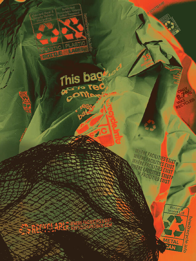
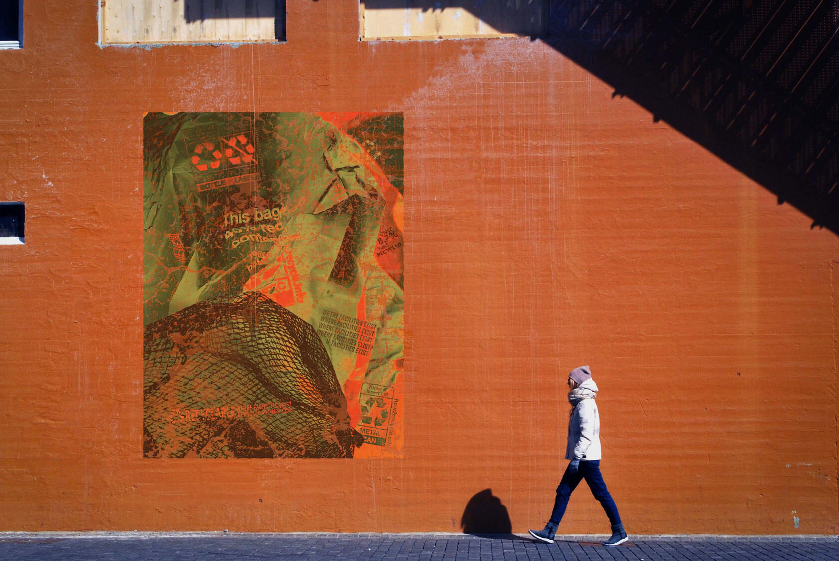
RECYCLING
Adobe Photoshop, Adobe Illustrator
18” x 24”
Material exploration was my initial goal for this project. I was drawn to the textures in objects around me, and I knew I wanted to incorporate that texture in my poster, so I began taking photos of various things. I discovered and explored typography in the folds of plastic bags and complicated recycling requirements for several items.Once I collected my images, I used Photoshop to recolor them in a green, orange, and brown color palette. These colors were selected to highlight the importance recycling has on our environment and raise caution about the effects of improper recycling. Within the poster are various recycling labels, directions, statistics, and resources such as earth911.com that people can use to learn how to recycle in their area properly.My goal was to draw people in with a visually appealing design and get their eyes moving across the composition to discover more details and information that conveyed my concept. If I could have this poster displayed anywhere, it would be substantial in a city where many people would walk or drive by it. Perhaps it could be on the side of a building or a billboard. This placement would help deliver this vital message to many people and hopefully get them to reflect on their recycling habits.
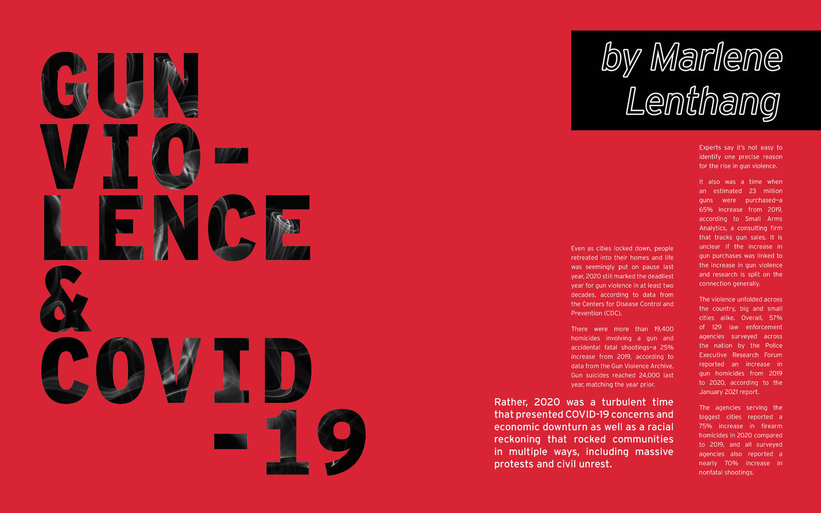
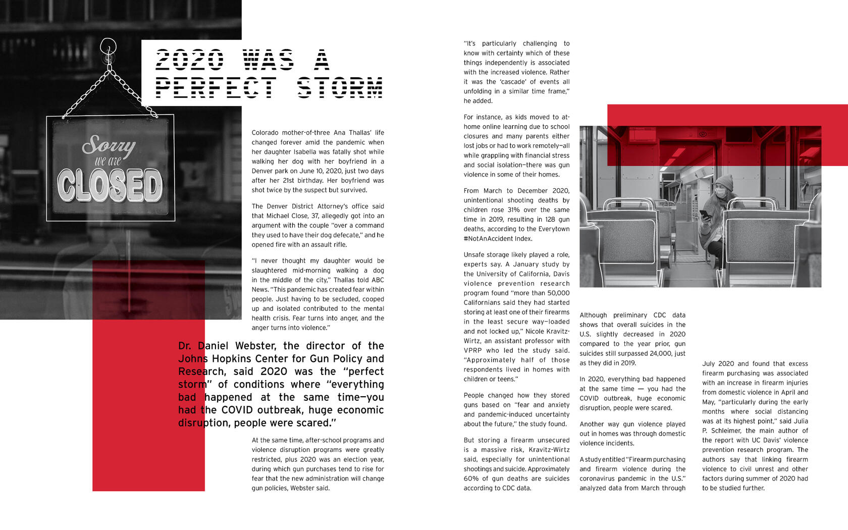
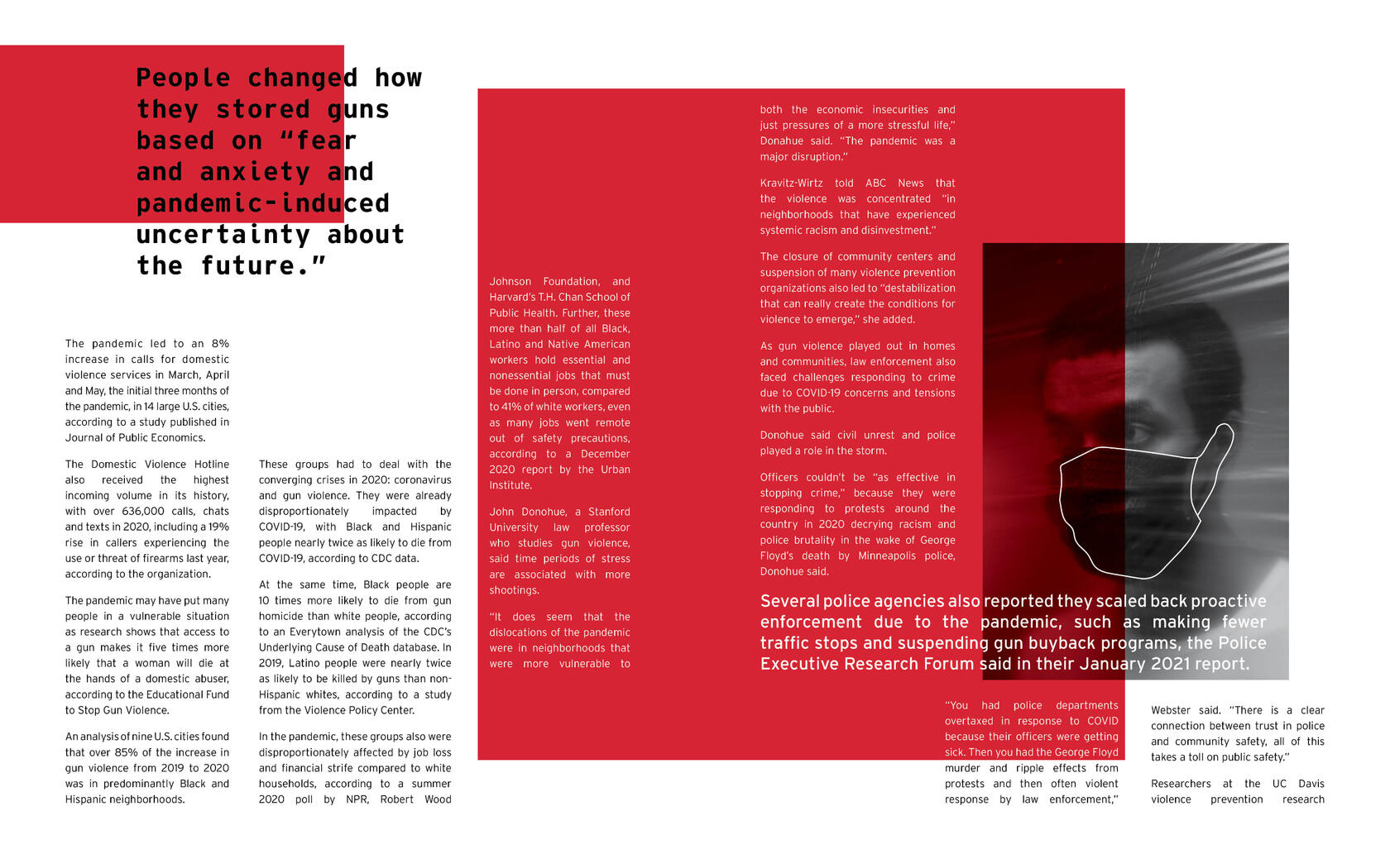
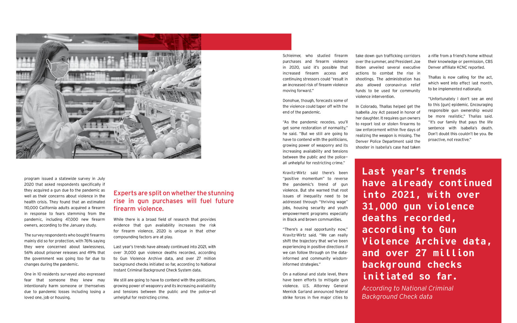
Gun Violence & Covid-19
Adobe InDesign
10” x 16” spreads
I started this project by researching a social issue I’m passionate about: gun violence. I was not surprised to find a correlation between gun violence and the coronavirus. However, I was shocked to discover that the rate of violence increased during the lockdown. It’s theorized that Covid-19 caused increased fear and anxiety, leading to gun violence rates rising in 2020.In my design of these spreads, I wanted to showcase this anxiety and violence by using high contrast, sharp shapes, and text that varies in size and breaks the grid’s boundaries.
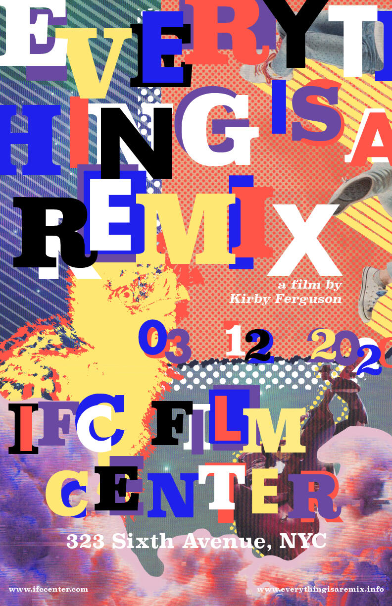
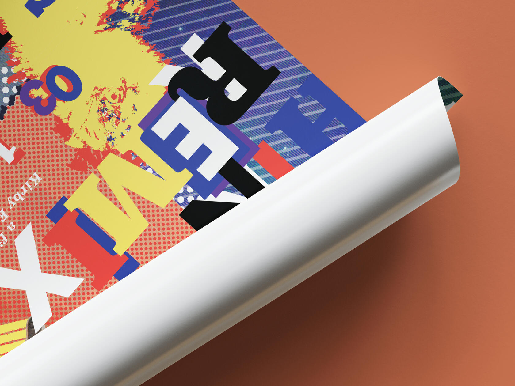
Everything is a Remix
Adobe Photoshop
11” x 17”
This project was created with elements I cut out and scanned from various magazines. I collaged these images and added text to make a movie poster for Everything is a Remix. The text had to include the title, theater location, release date, and the websites for the theater and the movie.I embraced the textures from scanning in images and explored layering images, textures, fonts, and bright colors. Jennifer Morla’s work inspired my design, and I enjoyed experimenting with texture and finding balance within these elements.
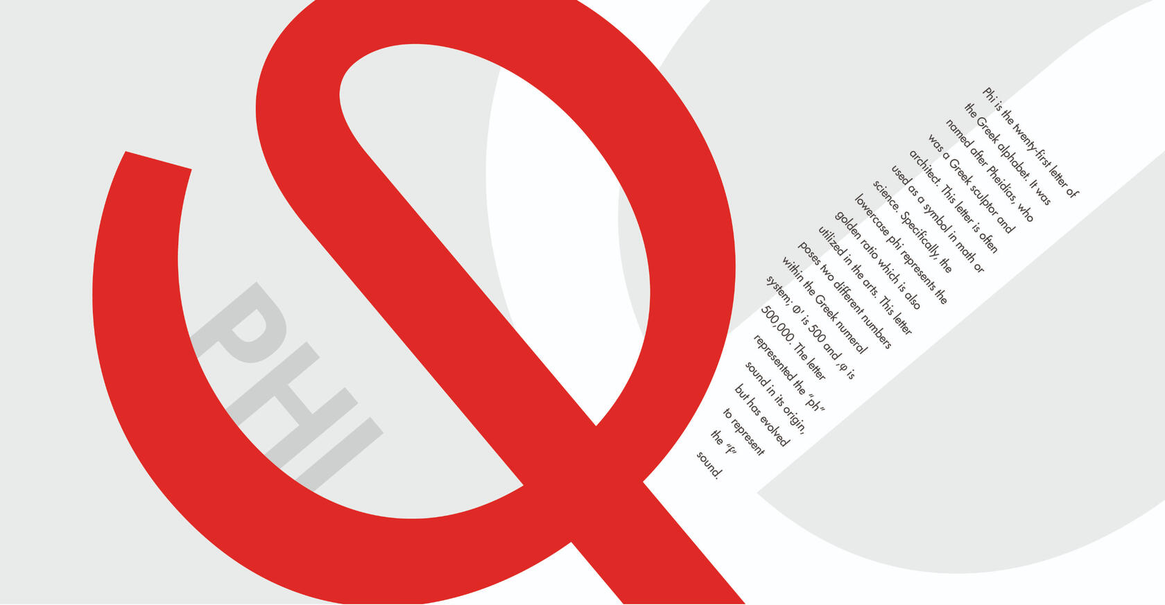
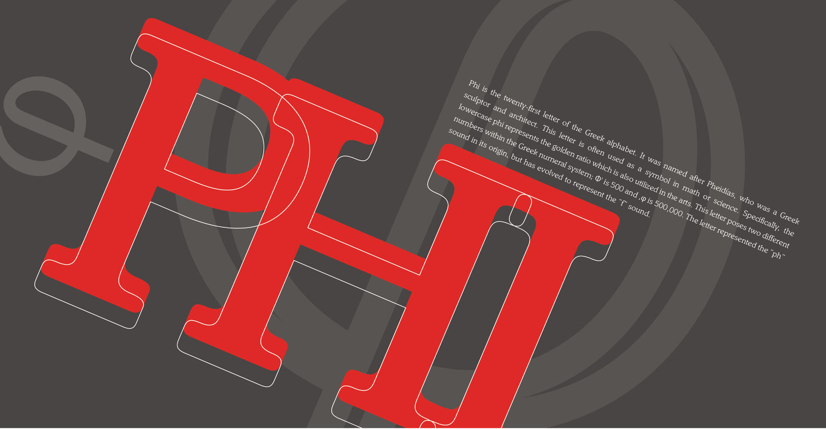
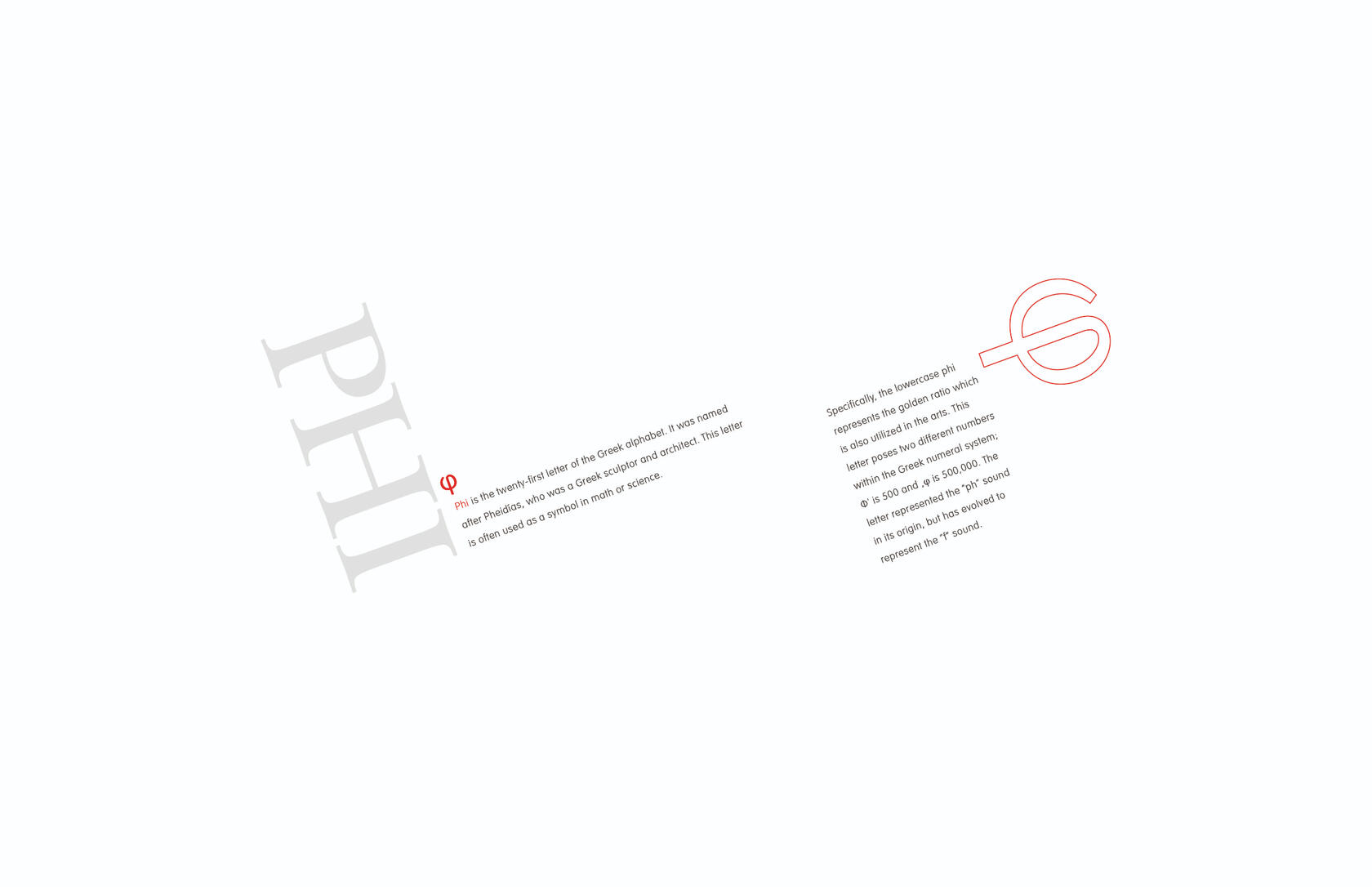
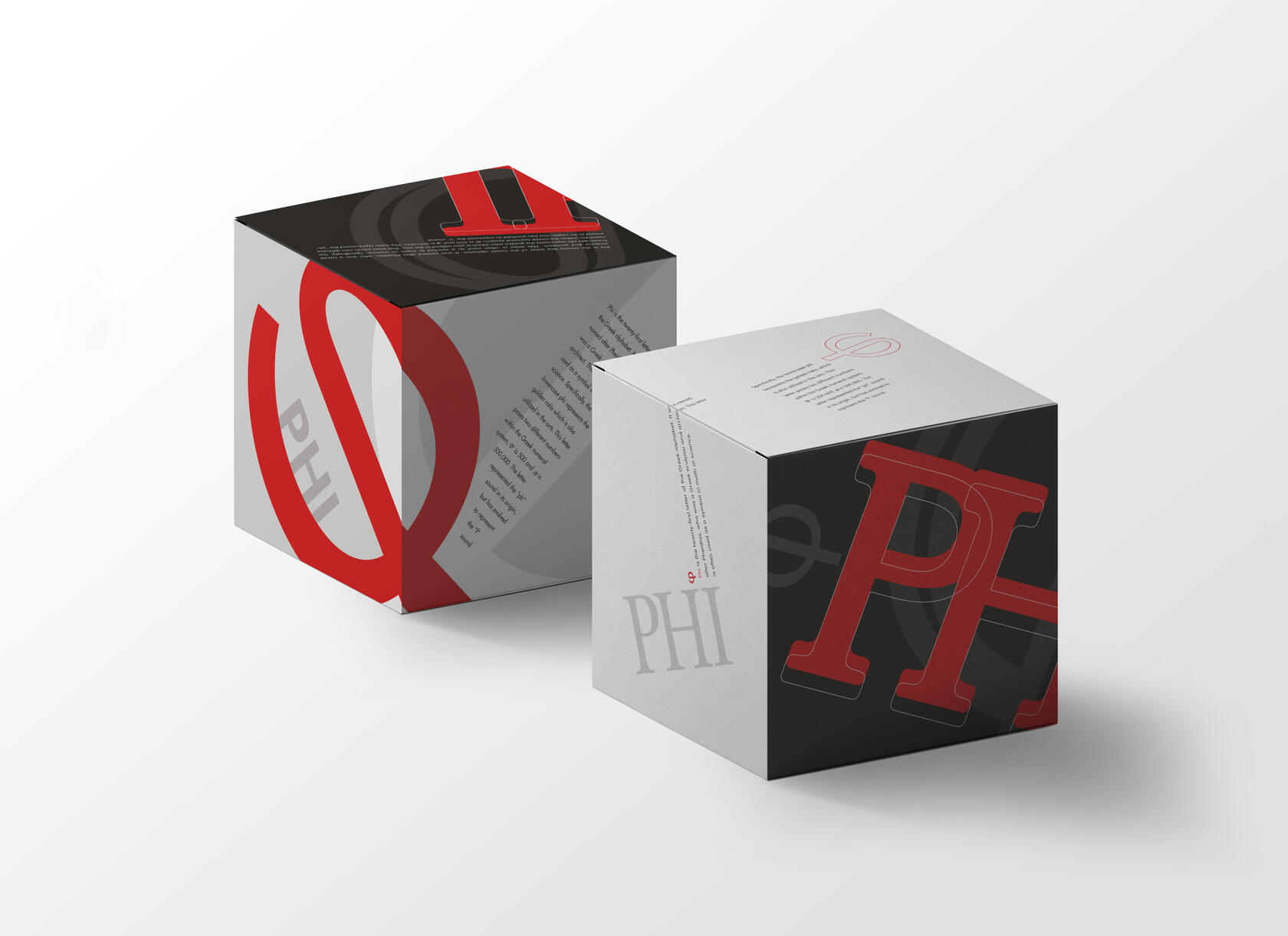
Early Letter Form
Adobe Illustrator
6” x 6” x 6" cube
For this project, I selected a letter from the Greek alphabet, researched it, and wrote a short paragraph on the history of that letter form. I was limited to a color palette of red and black—and tints of black—to create my designs. In addition, all body copy had to be 9pt. I created three unique solutions, each distinctively different and following additional guidelines.The first spread shows the Phi symbol as the most prominent element. The name of the Greek letter is the most prominent in the next, and the final solution has the body copy as the most prominent element. These limitations and guidelines challenged me and made my hierarchy skills stronger.
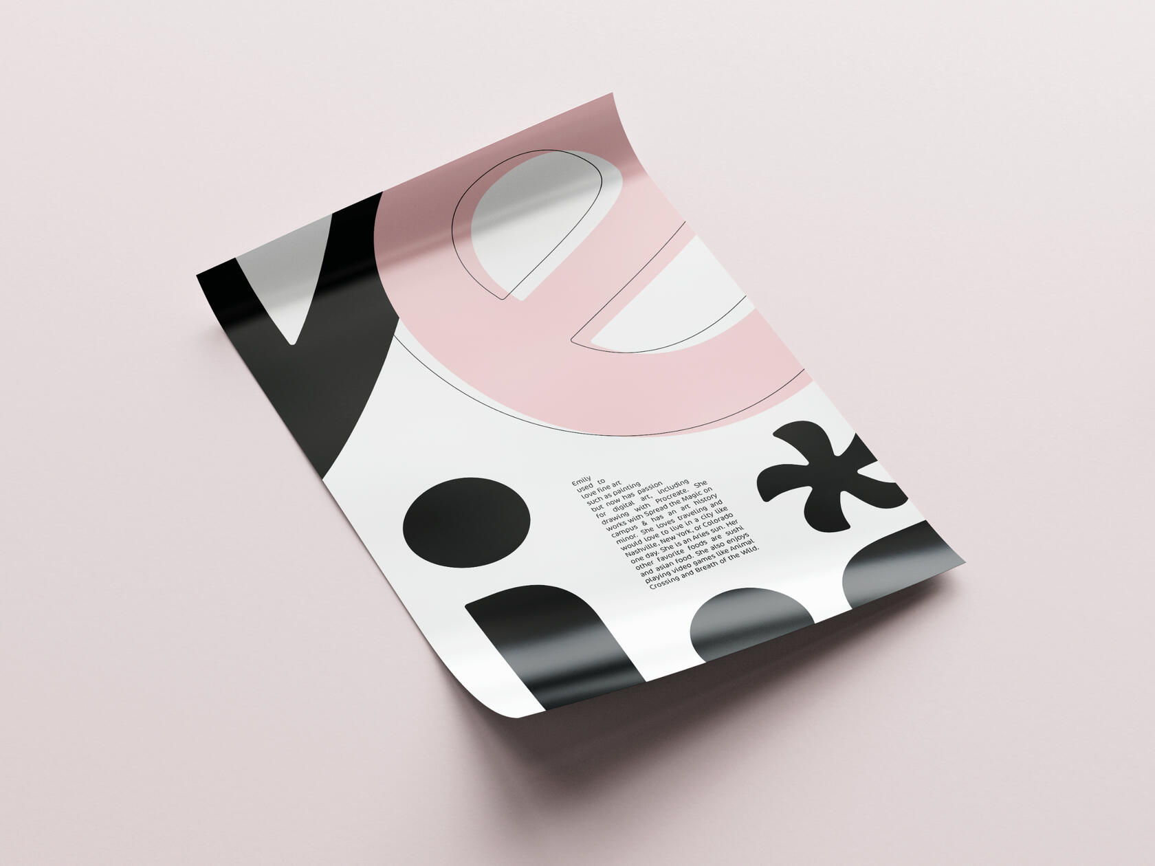
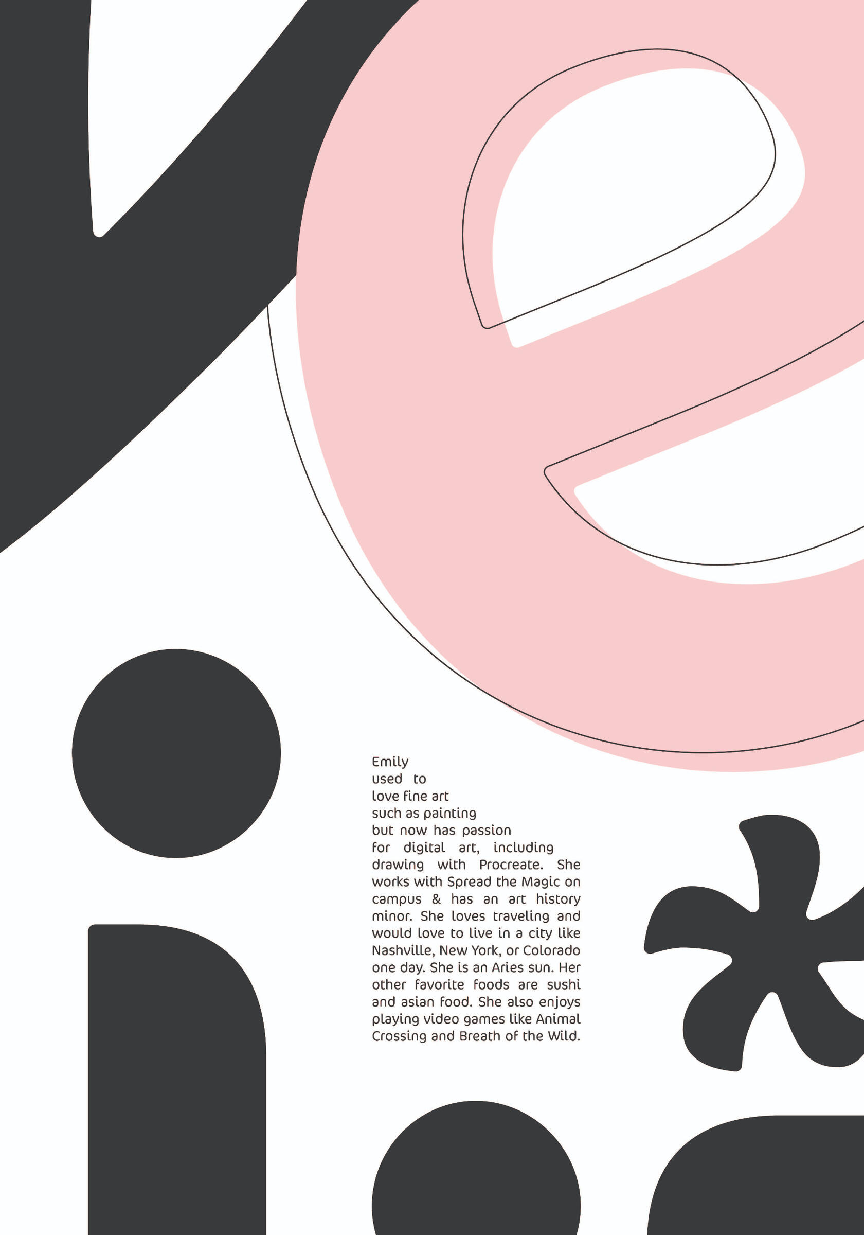
Classmate Introduction
Adobe Illustrator
14” x 20”
I was assigned a classmate to interview and create a typographic poster representing her. I had just met her, so I interviewed her to learn more about her personality and character traits. My initial impression of Emily was that she has a great fashion sense and wears eccentric outfits with funky earrings. She is introverted, does not enjoy being the center of attention, and is very confident. From my interview, I learned that she is fun and bold yet structured. She keeps organized with a planner but still enjoys traveling and hanging out with her friends.I chose a round font, Cocon Pro, that suited her personality and composed my design along a grid to portray her structured character trait. Using some letters from her name, I added an asterisk to represent Emily’s liveliness and mimic the fun earrings she always wears. Finally, I included a pop of her favorite color and softened the corners to portray her personality effectively.
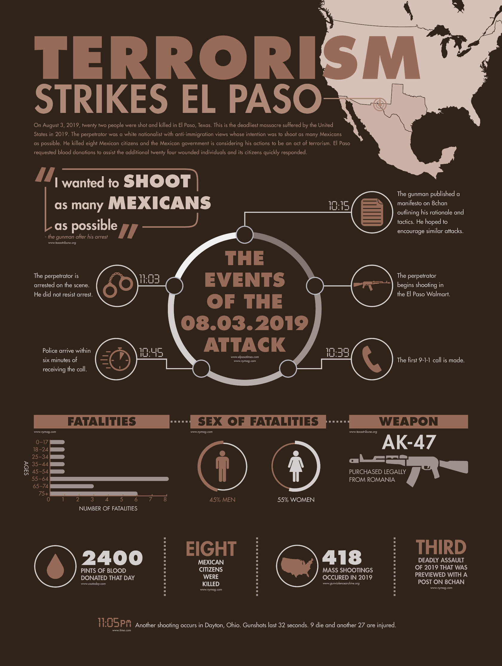
Information Graphic
Adobe Illustrator
18” x 24”
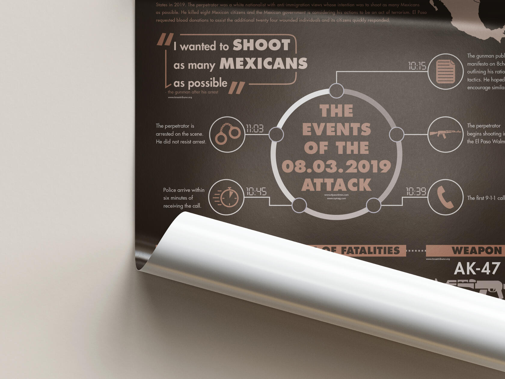
In this project, I researched and selected a nationwide issue to create an information graphic. I chose gun violence and mass shootings as my topic. My initial goal was to tackle this topic as a whole, but I realized there are so many complexities concerning it that I needed to narrow it down. I focused my infographic on the August 3, 2019 El Paso massacre.I researched the tragedy and learned everything I could about the timing of events, the shooter, and the victims. I aimed to focus on the victims and avoid sensationalizing the shooter. To accomplish this, I established content areas, developed a color system, charts, and icons to aid the poster’s visual appeal and ensured the information was communicated effectively.
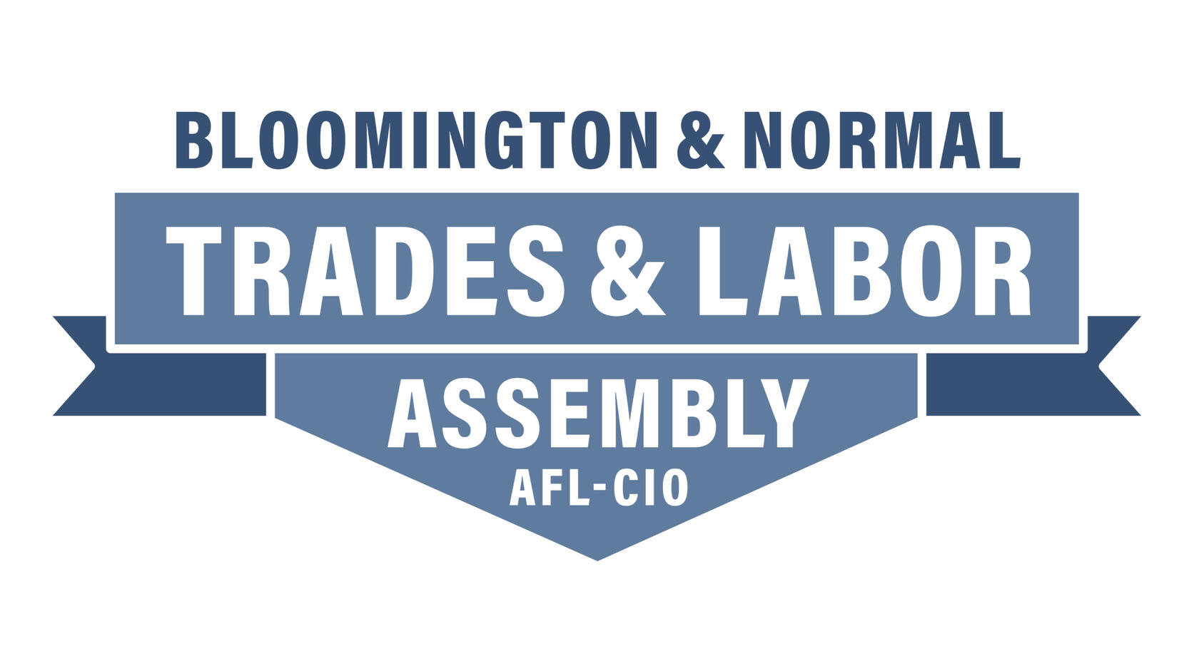
Bloomington & Normal Labor Union Logo
Adobe Illustrator
This logo was designed in collaboration with Amanda Haubenreiser, Tony Williams, and Erica Mallek. We collaborated on this logo during our Design Streak Studio internship.We proposed a wordmark as our group’s logo option. This logo features a contemporary sans-serif font that serves to remind the community of the future of the labor union. The typeface chosen is called Acumin Pro in the condensed style. It offers balance to the logo, which aligns with the union’s values. The wordmark provides a classic option that stands the test of time. The bold angles offer strength and give weight to the stacked text, which is aligned in a banner shape.The overall color of the logo is blue. Blue symbolizes unity, stability, and loyalty, all values and traits found within the union. We chose to use navy blue for its connection to earth tones which call back to the use of the hand and organic nature. We complemented this with a steel blue, offering a subtle contrast while still looking cohesive.
2020 Experience as Icons
Adobe Illustrator
11" x 17"
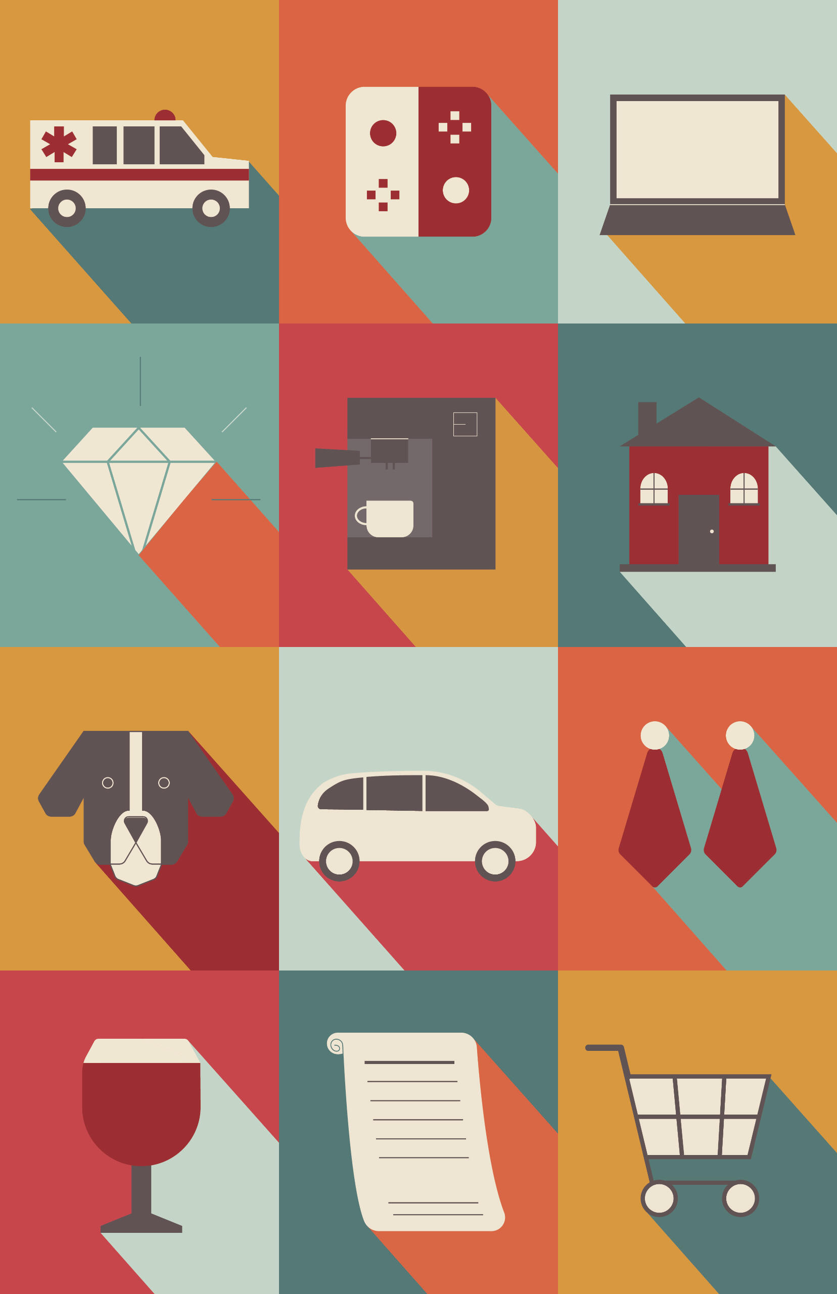
This project involved me reflecting on my 2020 experience to convey it in 12 icons and an animation format. I’m sure everyone can relate to the theme of disarray and isolation throughout 2020. My pandemic experience involved me working throughout it in retail, attending school, and getting a second job as an EMT on the ambulance. Many things were happening in my life, including buying a house, getting a dog, turning 21, and getting engaged. However, with everything happening in the world, these significant events barely seemed memorable.I wanted to carry this feeling into my icons by making them flat with desaturated colors. I kept the drawings and color palette simplified and minimal. I kept this style consistent in my animation by straightforwardly moving the elements on and off the screen.
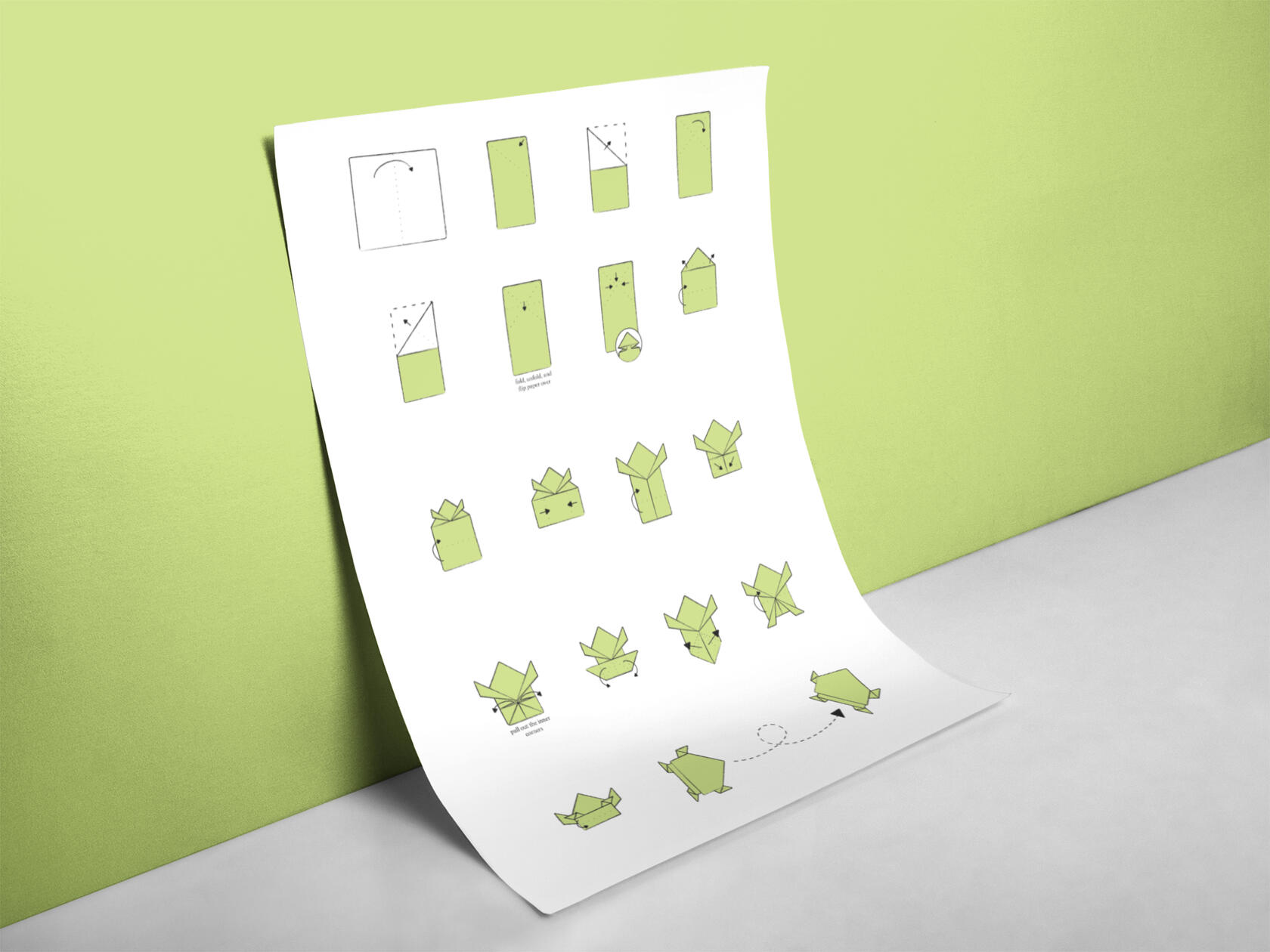
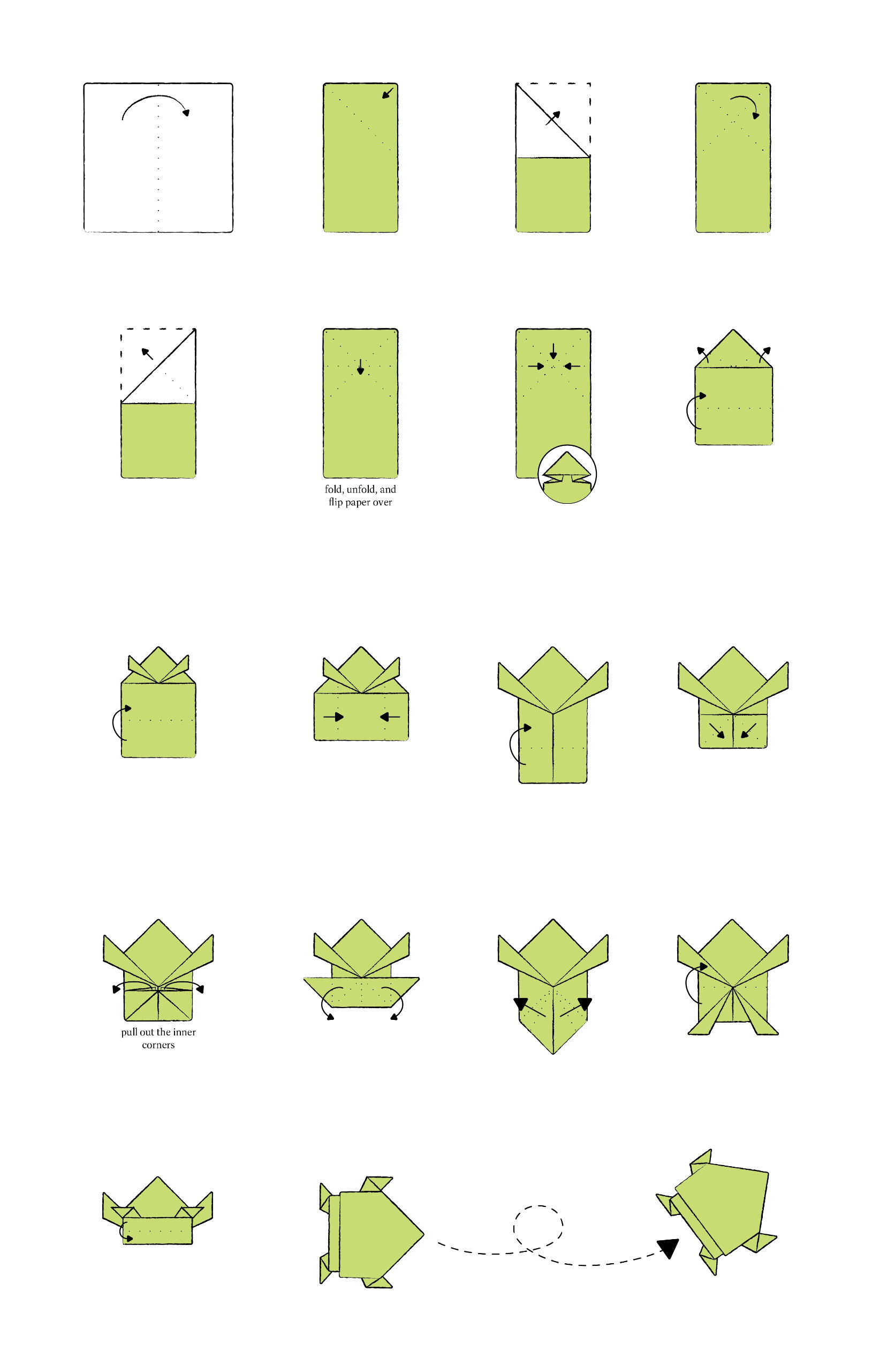
Origami Frog
Adobe Illustrator
10" x 16”
The challenge of this project was creating a poster that teaches viewers how to fold origami while using the least amount of words possible. I selected a jumping origami frog due to its significance in Japanese culture. For example, they are often gifted as a send-off gift for someone who may be going on a trip. I drew the steps out, had classmates test them for clarity, and made alterations as needed.I arranged the 17 steps on a grid using only black, white, and green. I added hand-drawn strokes, dashed lines, arrows, closeups, and words as needed to make the steps as straightforward as possible. The instructions end with a visual of the result: a jumping origami frog.
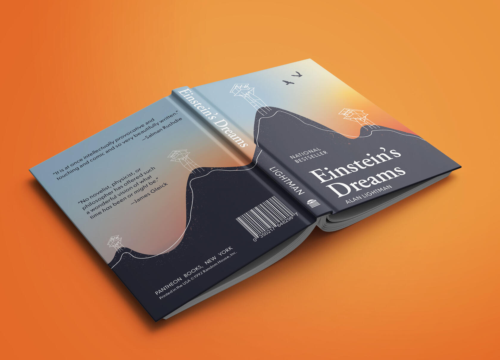
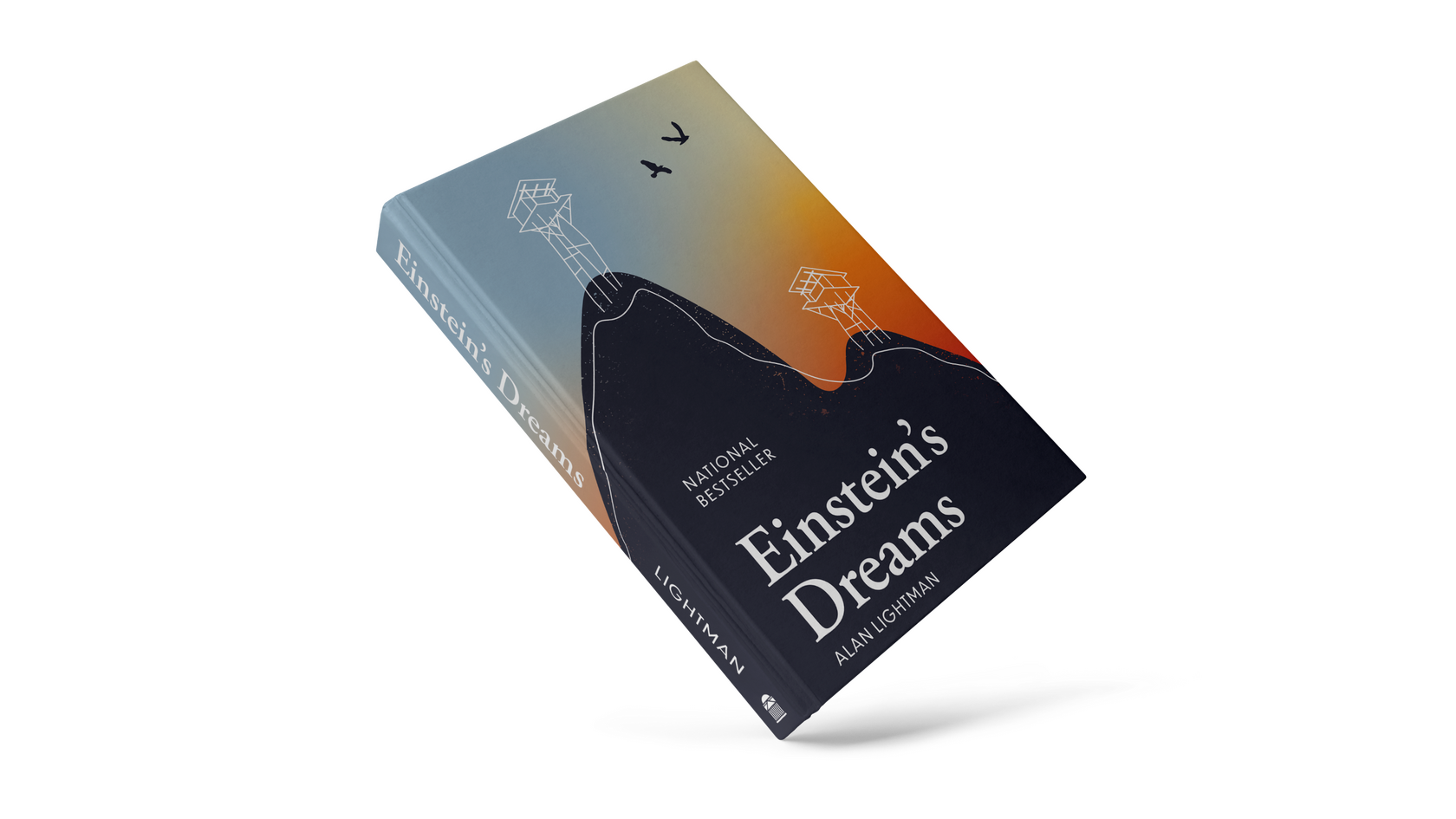
Einstein's Dreams
Adobe Illustrator
15.5” x 6.5"
This book cover was designed based on the 26 April 1905 chapter in Einstein’s Dreams by Alan Lightman. This story is about time flowing more slowly the further away you are from the earth’s center. People began to move to the mountains in an attempt to age slower. They built houses on stilts and, over time, height became representative of one’s status. These houses were described as “flocks of fat birds squatting on long skinny legs.”One of the aspects of this story that stood out to me the most was how the people in the mountains became so adjusted to that lifestyle that they didn’t question it, but instead looked at the people beneath them and were envious of how happy and carefree they appeared.I found the visuals of people frantically running up and down ladders to grab necessities like groceries fascinating, and I wanted to create a book cover that reflected these perceptions. The gradient mimics the fun and carefree nature the lower citizens experienced in contrast to the jealousy of the elevated individuals.
Garlic Press Poster
Adobe InDesign
10" x 16.5"
These two posters were designed for cooking classes held at a local business, The Garlic Press. These classes are for various types of dishes from multiple cultures. The company is known for having unique and fun gifts. I had fun exploring the fun spirit of this store with my usage of typography and colors.In the first poster, I selected Lemongrass for the heading, subheadings, dates, and price because of its softness and handwritten appearance. This font is intended for display use only, so I utilized Tenso for the body copy. Tenso is another sans serif font that carries the character of Lemongrass along with it. Green, orange, pink, and cream are the colors I chose to use due to their lively nature and relation to food.
I continued to use Tenso for my second poster option because of its playful Grotesk sans serif qualities. Typographic experimentation draws attention and is carefully arranged on a grid to maintain hierarchy and legibility. I selected several colors commonly used when cooking, especially fruits and vegetables and carried that into my design. These rich colors reinforce the feel of the store and keep the typography grounded.


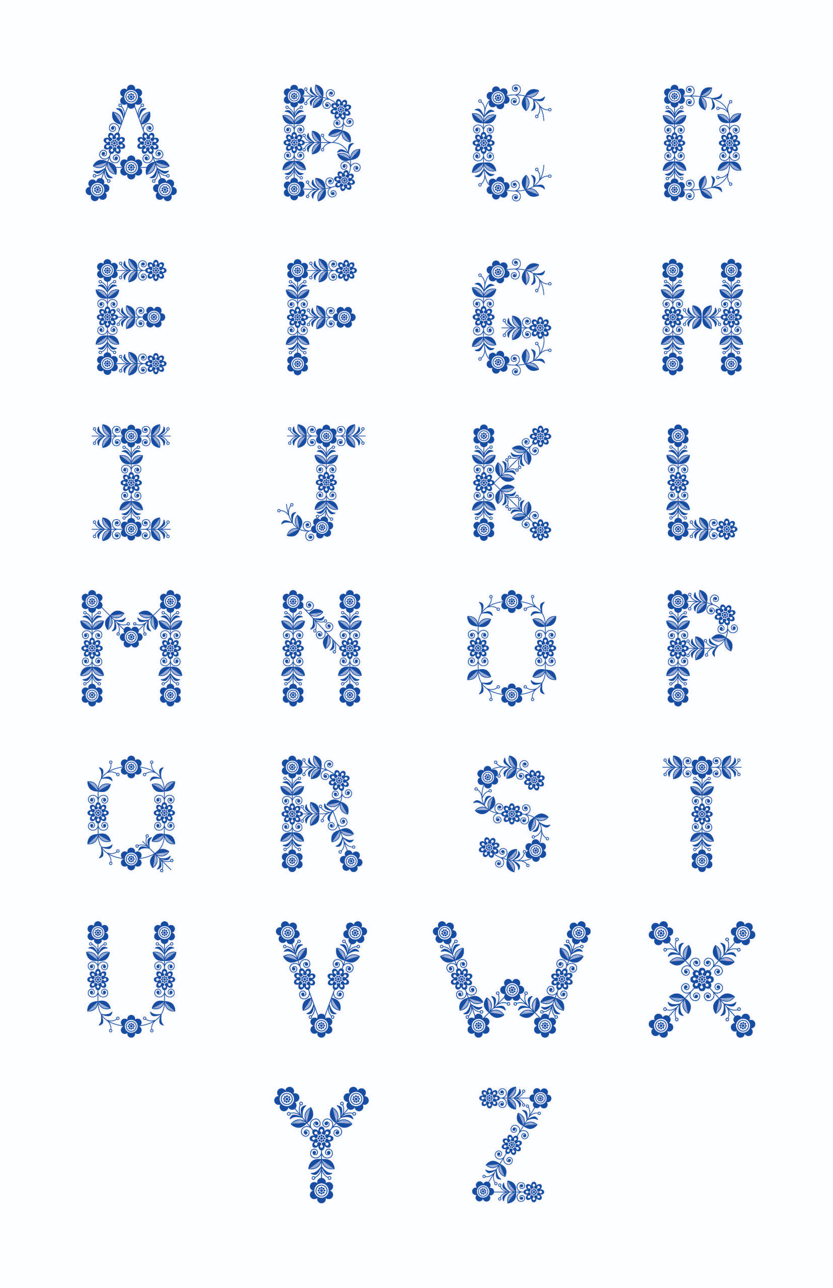
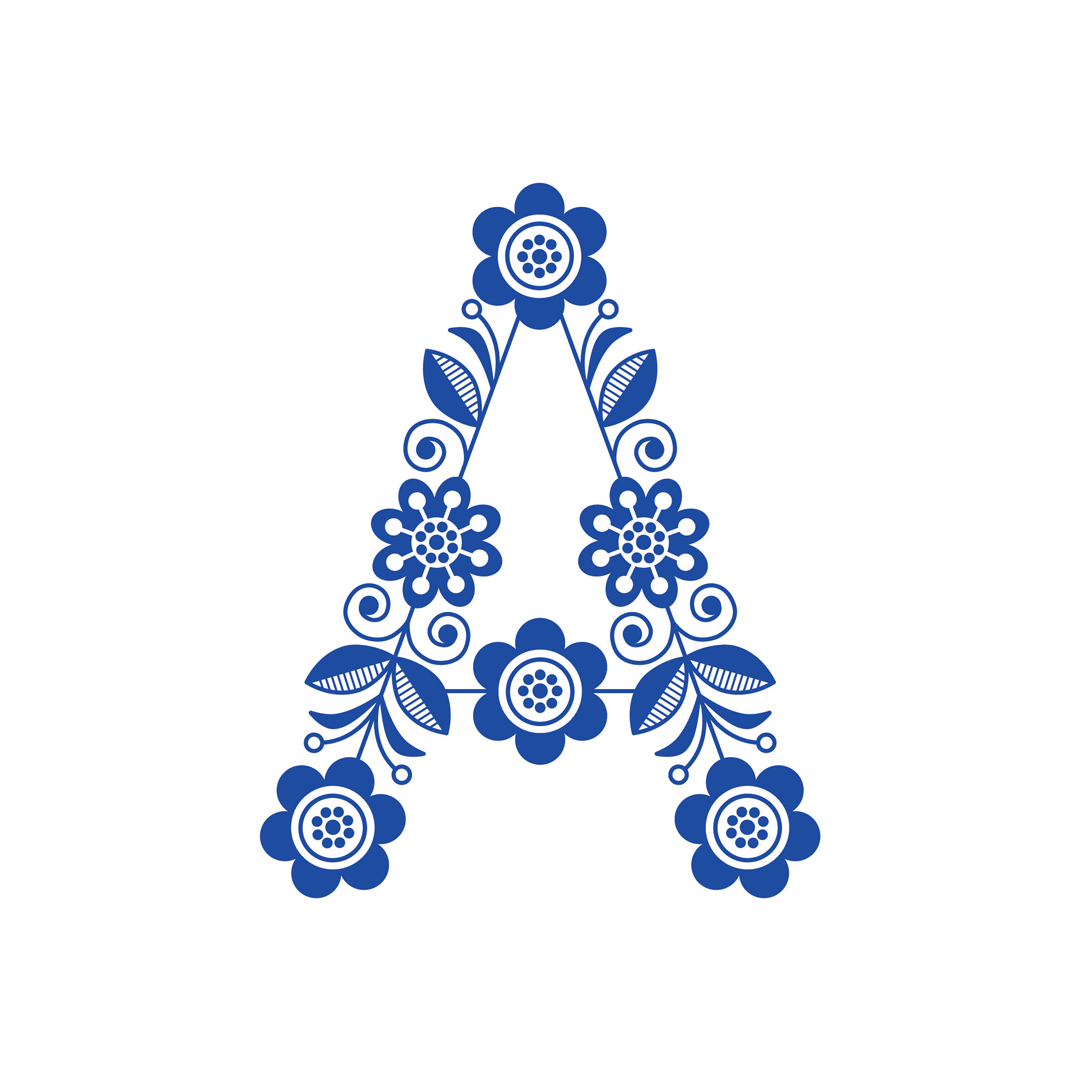
Heritage Inspired Alphabet
Adobe Illustrator
11" x 17" poster
Growing up, I hadn’t known much about my family’s heritage. I only knew that my mom’s side was mainly Irish, and my dad’s side was primarily Swedish. I used ancestry.com to learn more, tracing my family tree back to the 1800s. In doing so, I realized that my genetics are around 50% Swedish, and I decided to use this part of my heritage to base my design on.I researched Swedish culture further and was fascinated with the traditional folk patterns from dishware to dresses. Many of these folk patterns consisted of floral and natural elements, and I used this motif in my design. I created various symmetrical nature-inspired elements and arranged them as balanced as possible to create each letter of the alphabet. I made all the colors royal blue because this is the primary color used in Swedish dishware and folk dresses.
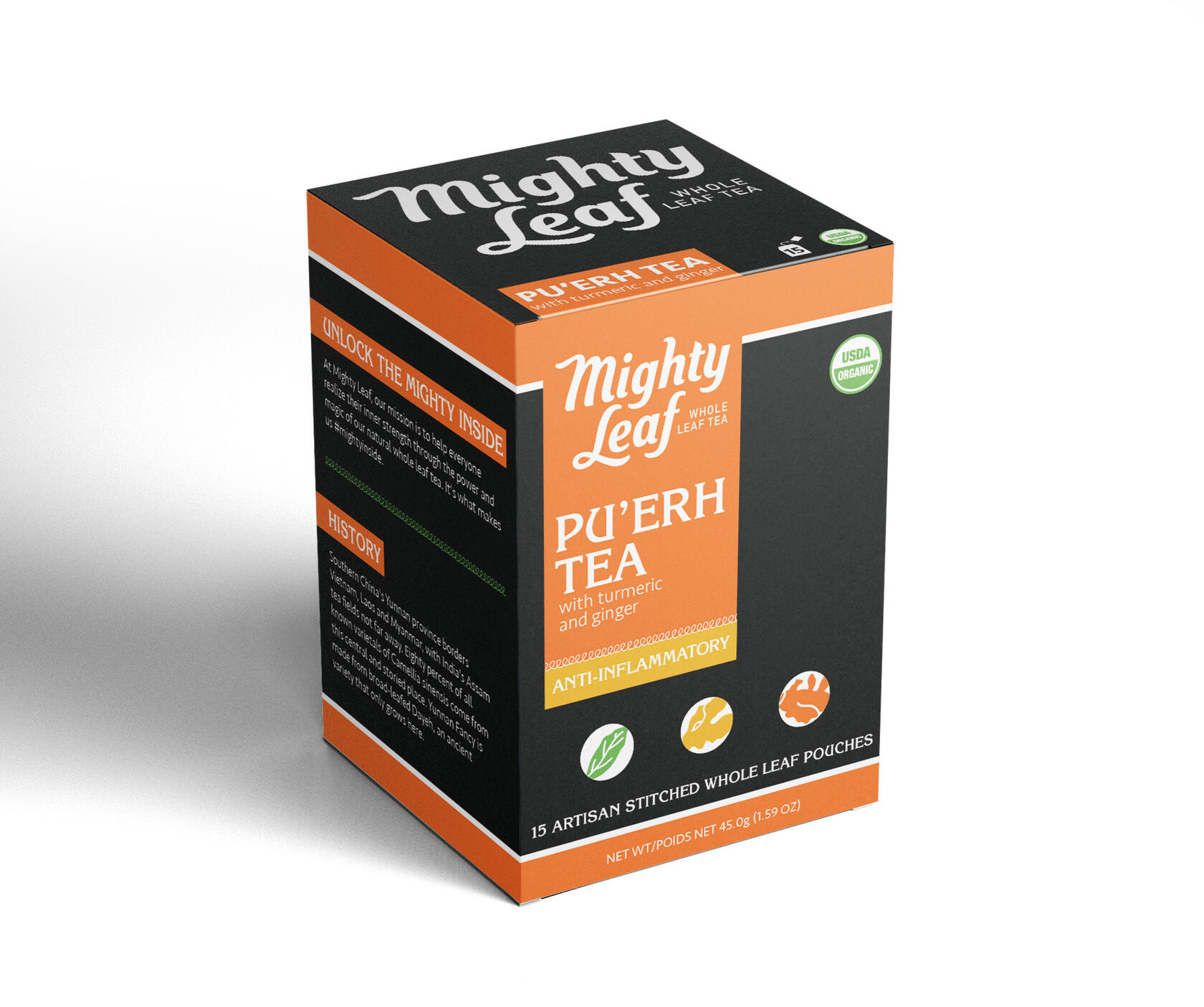
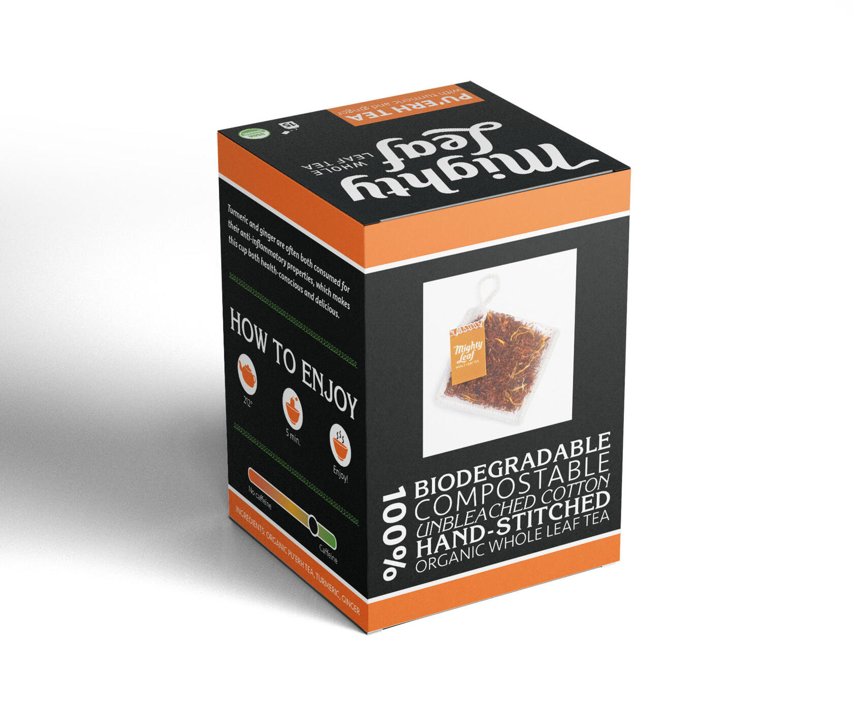
Tea Packaging
Adobe Illustrator
3.5” x 3.5” x 5"
This project was an expansion of the Mighty Leaf Tea brand. I researched and developed a target audience to decide what type of tea to add to their selections. Once I established this information, I created mood boards, defined the tea’s ingredients, and selected the color palette. My packaging for the product was designed using my research to align with my target audience’s needs and desires.My product is Pu’erh tea with turmeric and ginger. It is marketed towards young, busy, eco-friendly, and adventurous people who need that extra energy boost to help them partake in the activities they enjoy that help them destress. Turmeric reduces joint pain, detoxes the liver, and increases digestion. Ginger also assists in decreasing inflammation as well as boosting immunity.
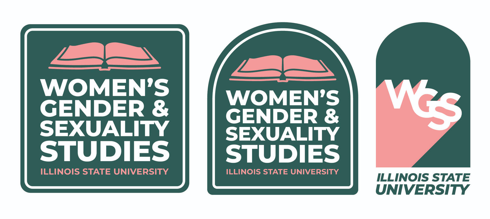
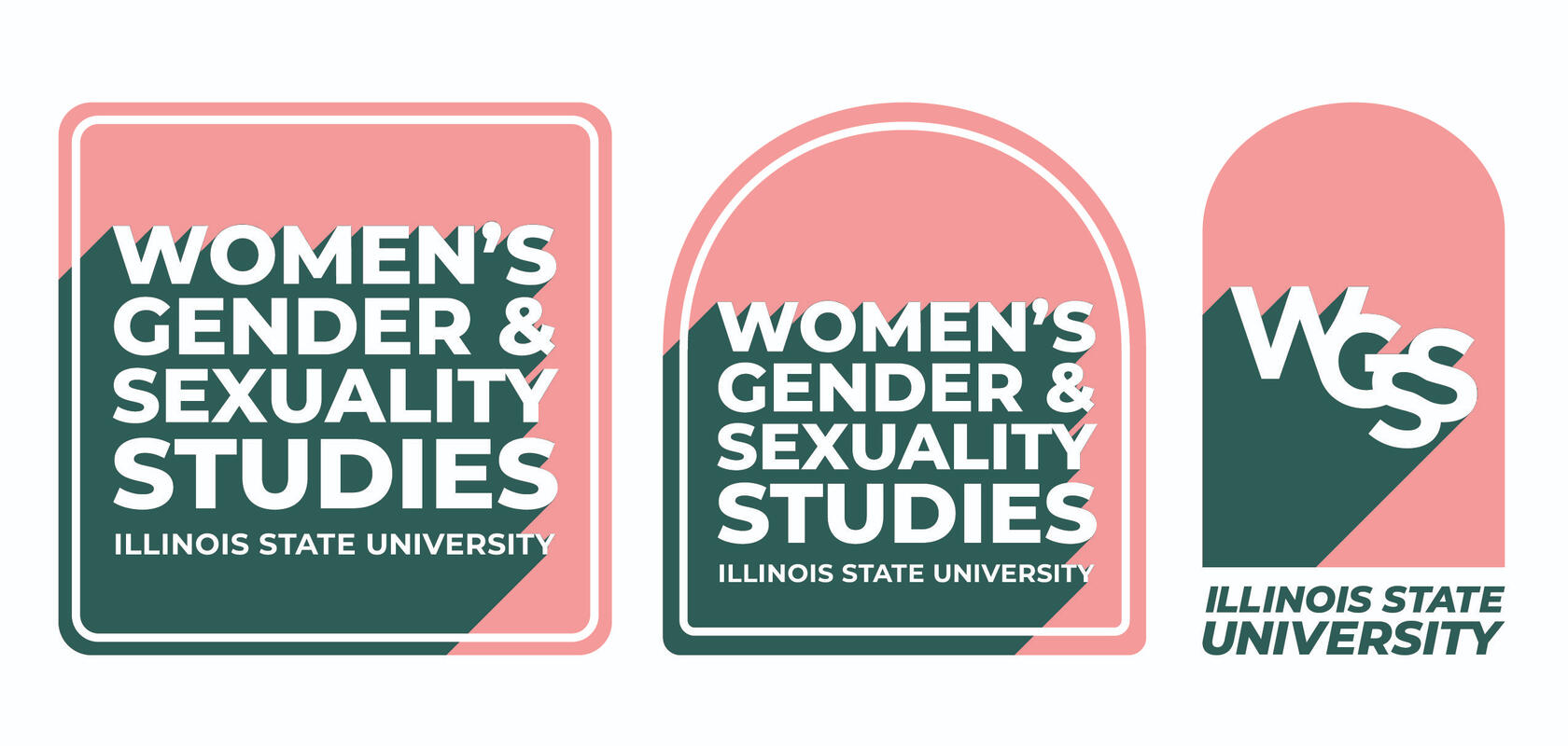
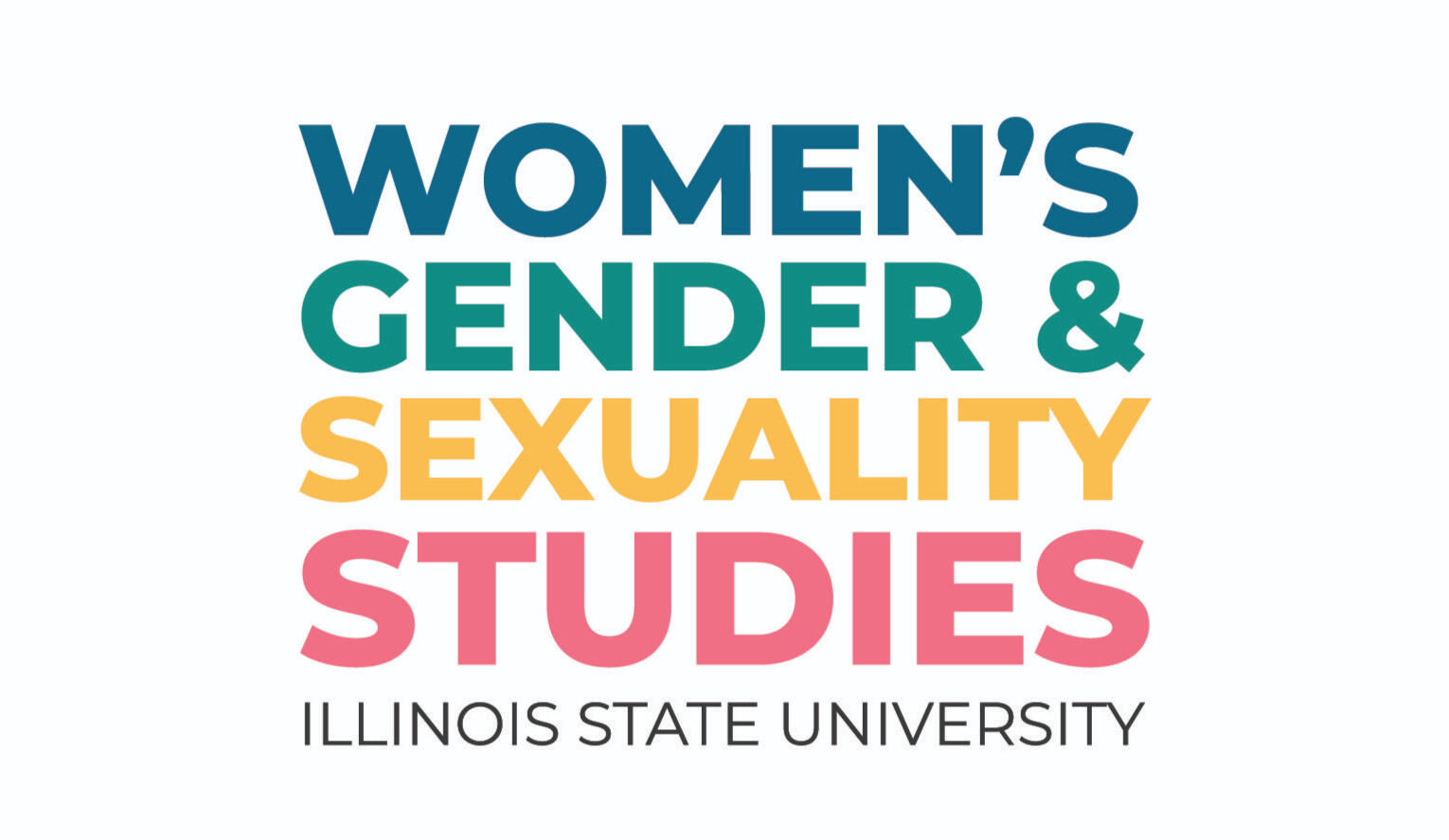
Women's, Gender, and Sexuality Studies Logo
Adobe Illustrator
This logo was designed in collaboration with Molly McCafferty and Amanda Haubenreiser. We collaborated on this logo during our Design Streak Studio internship.Our logo highlights the power and uniqueness of the Women’s, Gender, and Sexuality Studies (WGSS) program without defaulting to stereotypes. The typeface used in this logo is Montserrat, designed by the Argentine graphic designer Julieta Ulanovsky in 2011, showcasing women's contributions to design.The type is set in a justified format, establishing a solid sense of balance and stability. The shadow behind the logo tries to emulate the drop shadow of the previous logo and grounds the text within the shape's borders, adding depth. The upward angle symbolizes the growth of the WGSS program. The rounded edges of the square provide a welcoming and non-confrontational feeling, balancing the energy from the bright, bold colors. The stroke outline featured in two of these options grounds the text further in the design and directs the viewer’s eyes directly to the text, which is bright and noticeable in white.The arched doorway in many cultures symbolizes new beginnings, transition, progress, and viewing the world from alternate perspectives. The arch denotes strength, hospitality, and openness in terms of architecture. It comprises three main parts: the column supports on each side, and the arch itself, referencing the three programs of study WGSS offers — the Undergraduate Minor, the Queer Studies Concentration, and the Graduate Certificates.The italic text for Illinois State University acts as a support that highlights the upward directional movement of the shadow behind the text. The book featured in this option is a classic reference to higher education and scholarship, and the Illinois State University emblem also features a book.
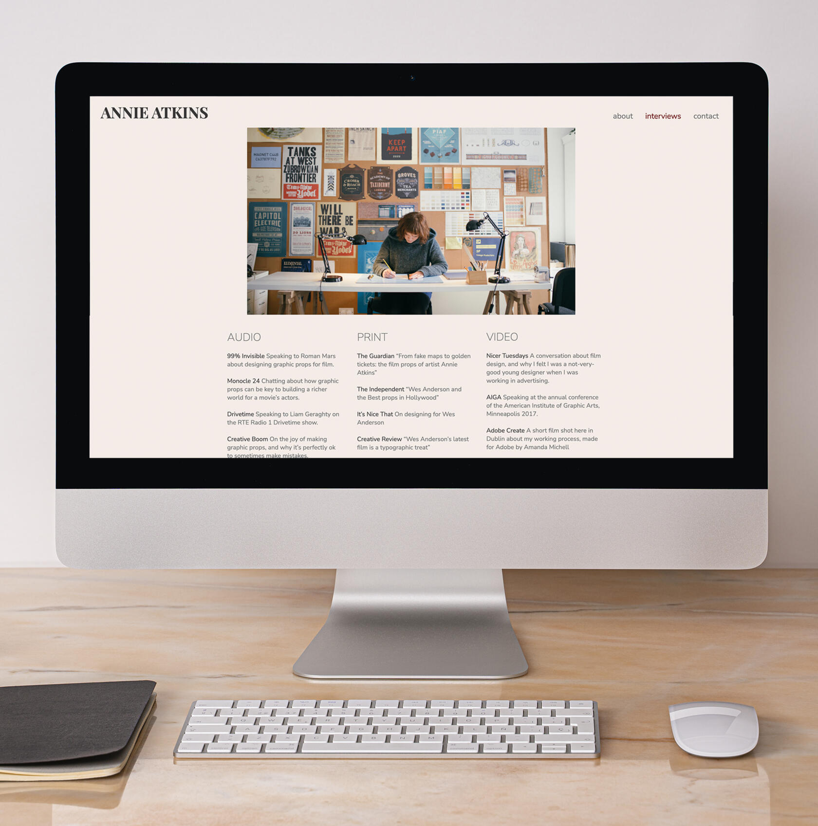
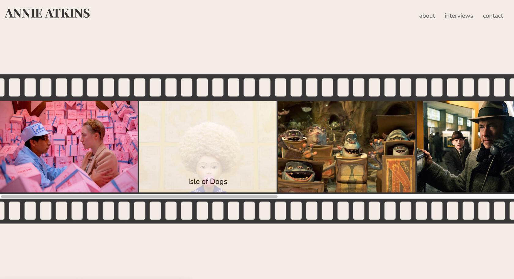
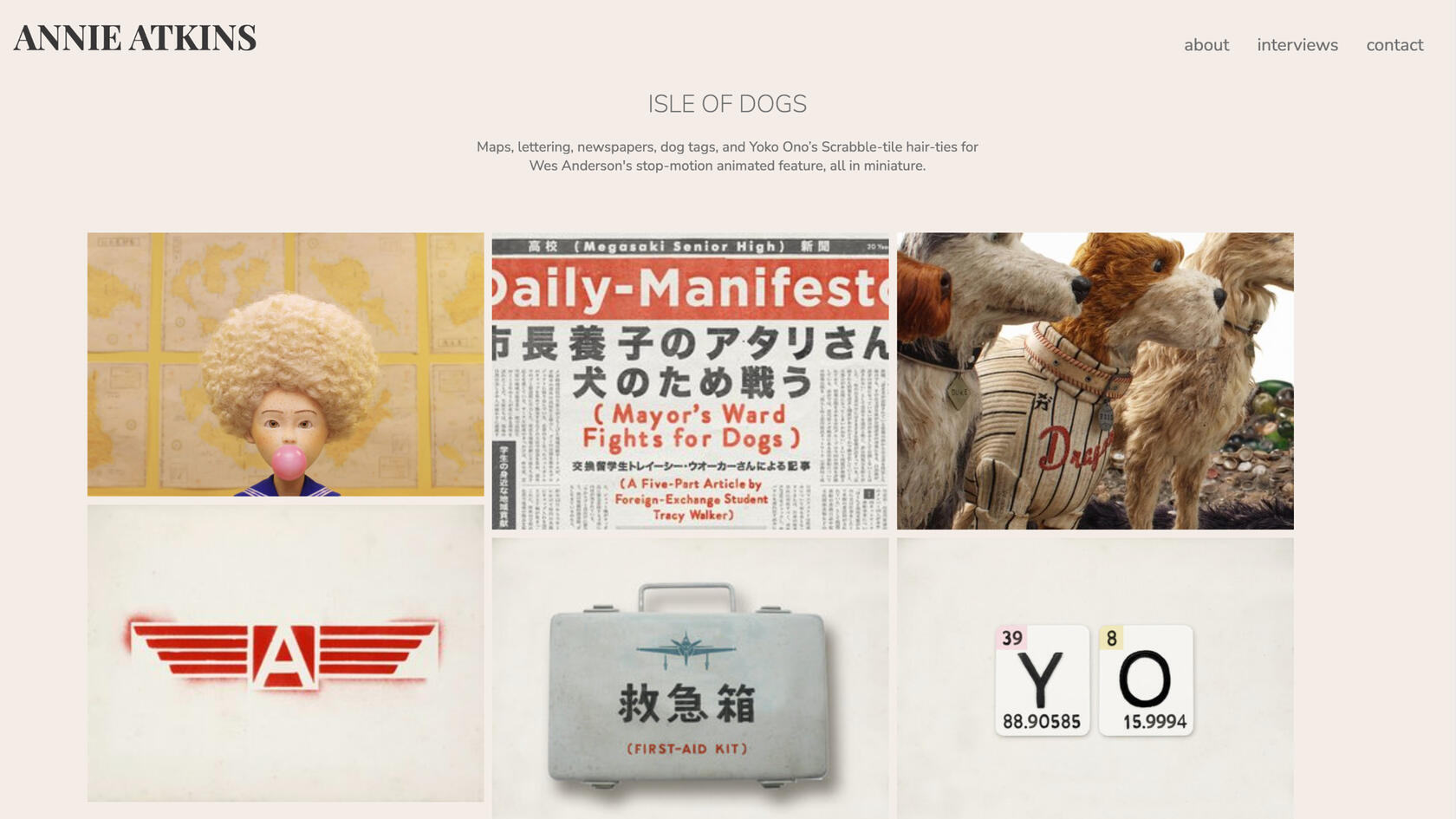
Annie Atkins Website
HTML and CSS
For this project, I selected a designer to research and create a website for them. I discovered Annie Atkins’ work and was immediately fascinated. I’ve watched many TV shows and movies but never thought about how a prop may be designed to fit a scene. Annie is a prop designer and designs everything on set, from signs to movie tickets to booklets and more.I was inspired by her existing website and emphasized her connection to films by including images in a film reel on the home page. Once the movie image is clicked on, you are brought to a new page showcasing the items Annie designed in it. I included another page to feature her interviews. She has various audio, print, and video interviews from which designers can take advice. Finally, I added a contact page where visitors can complete a form to get in touch. I also included social account information on this page.The biggest challenge I faced with this project was the coding itself. This website was the first one I coded from scratch, and I learned a lot. I even had fun! It was satisfying to see my vision come together.
Anxiety Social Campaign
Adobe Illustrator
11" x 17" posters
8.5" x 11" brochure, unfolded
For my social awareness campaign, I embraced a topic close to me: mental health. There is a strong stigma against mental health in our society. Because of this, I waited almost ten years of experiencing symptoms to seek help. I’ve had experience with physical symptoms caused by anxiety, and I had no clue that mental health complications could cause a physical reaction. My goal with this project was to raise awareness about this and show the helplessness people can feel when struggling with their mental health.I started this campaign by creating a series of three posters in which endless racing thoughts cloud a gender-neutral figure. I selected a color palette that expresses the highs and lows of struggling with mental health. I hoped the viewer would feel anxiety looking at it so they could relate to how some people feel daily. I also added a short sentence at the bottom of each poster to exemplify my concept. They say, “anxiety feels never-ending,” “anxiety doesn’t rest,” and “anxiety follows you everywhere.”I created a brochure for people who may not know as much about anxiety. It explains what anxiety is, how the body reacts to it, what helps treat it, and what people can do to help someone with anxiety. I carried over the string/ribbon motif from my drawings and used this same motif to create some stickers, tote bags, and a hoodie design. These items can be displayed or worn to normalize talking about mental health and help eliminate the stigma.


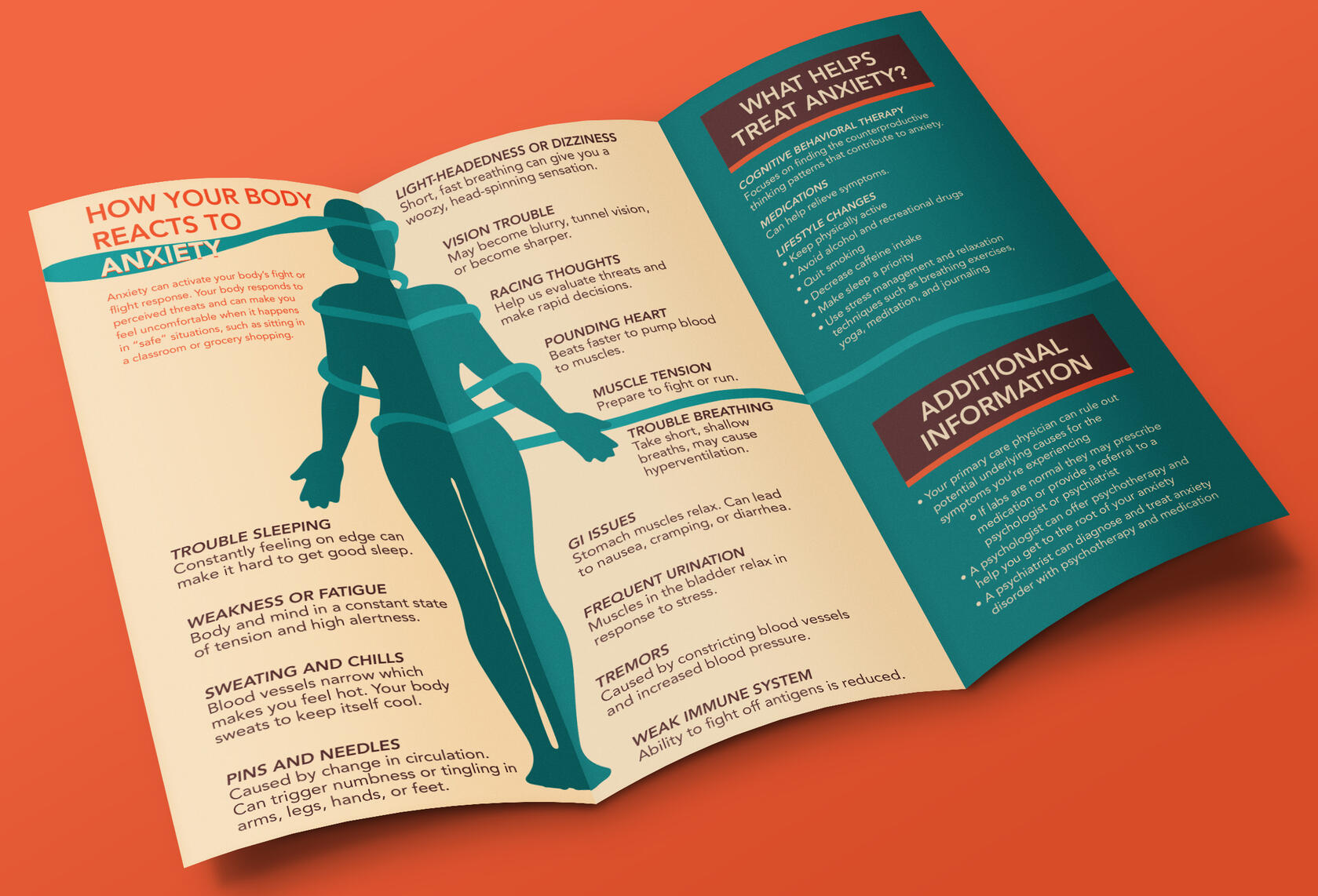
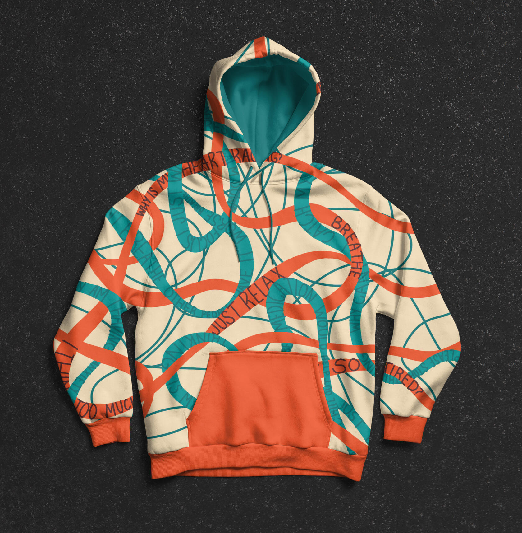


Illustration created of myself, by myself.
hi, i'm melissa.
Welcome! I’m Melissa Catanag, a graphic designer based in central Illinois with my husband, three cats, and our dog.I am open to all kinds of design work, although I am always drawn to branding and informational projects that allow me to showcase complex information in a pleasing way. My ambition is to help my clients tell their best stories and look good while doing it. This leads to designs with twists of depth and meaning that sit just beneath the surface.When I'm not working on my latest graphic design project, I might be thrift shopping, cuddling with my cats or working on a house project. If you like my work, please reach out by completing my contact form. I can't wait to learn about your design needs!
contact
If you're interested in connecting with me, send me a message below!
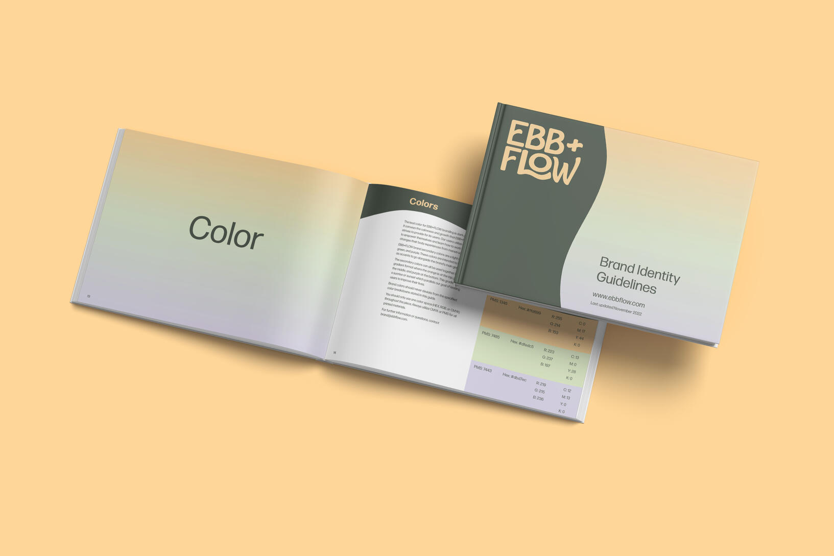
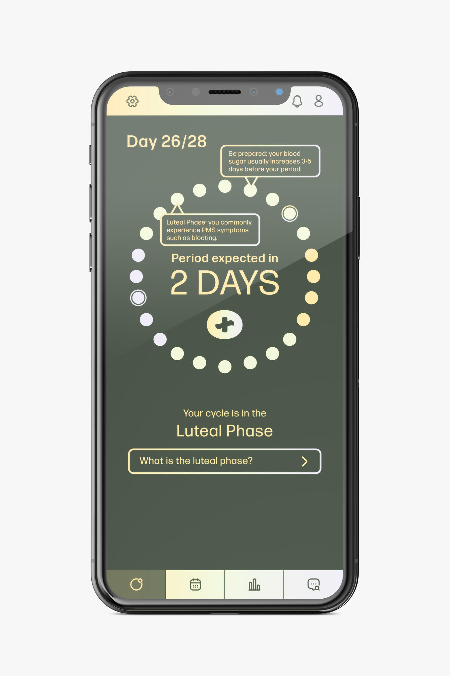
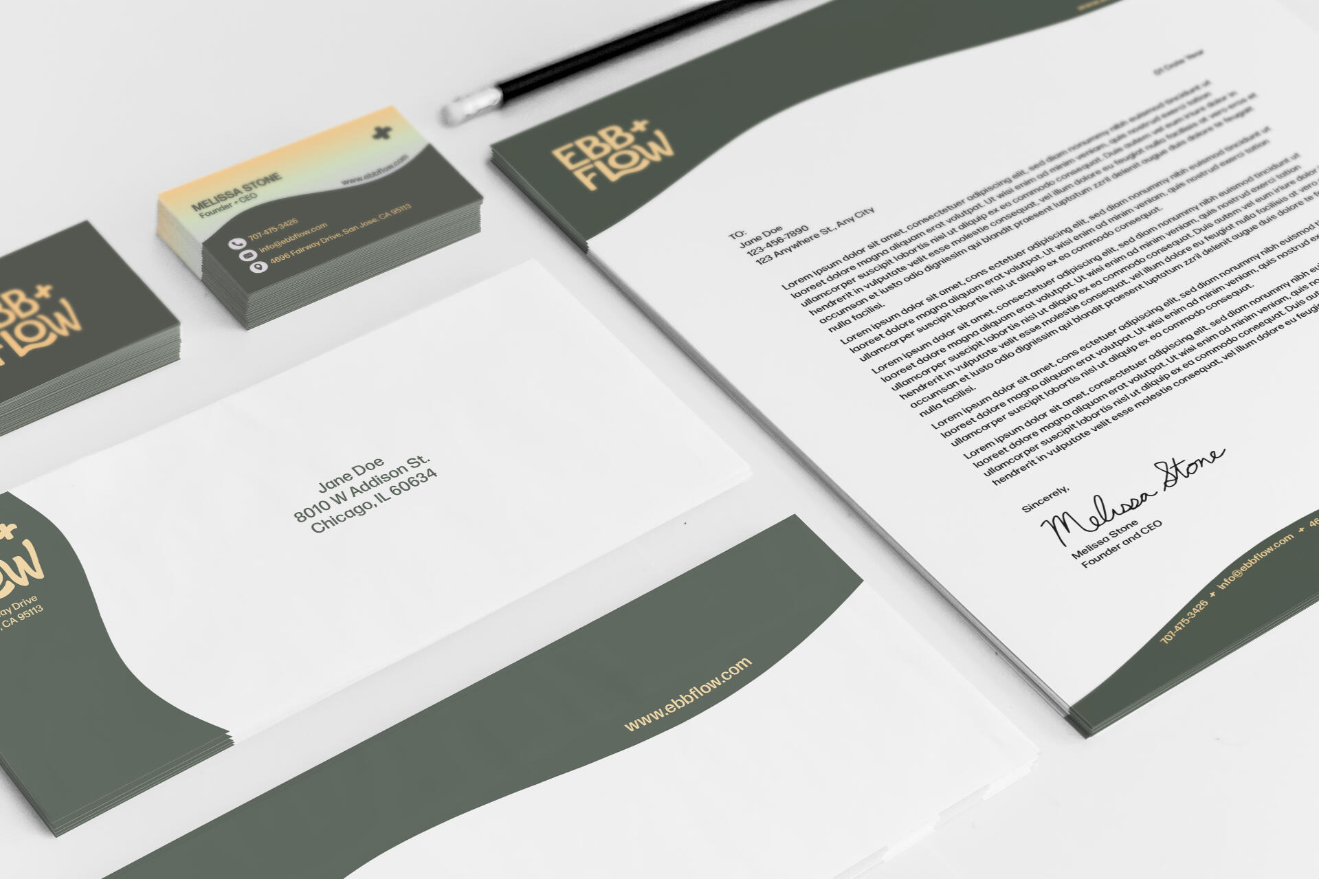
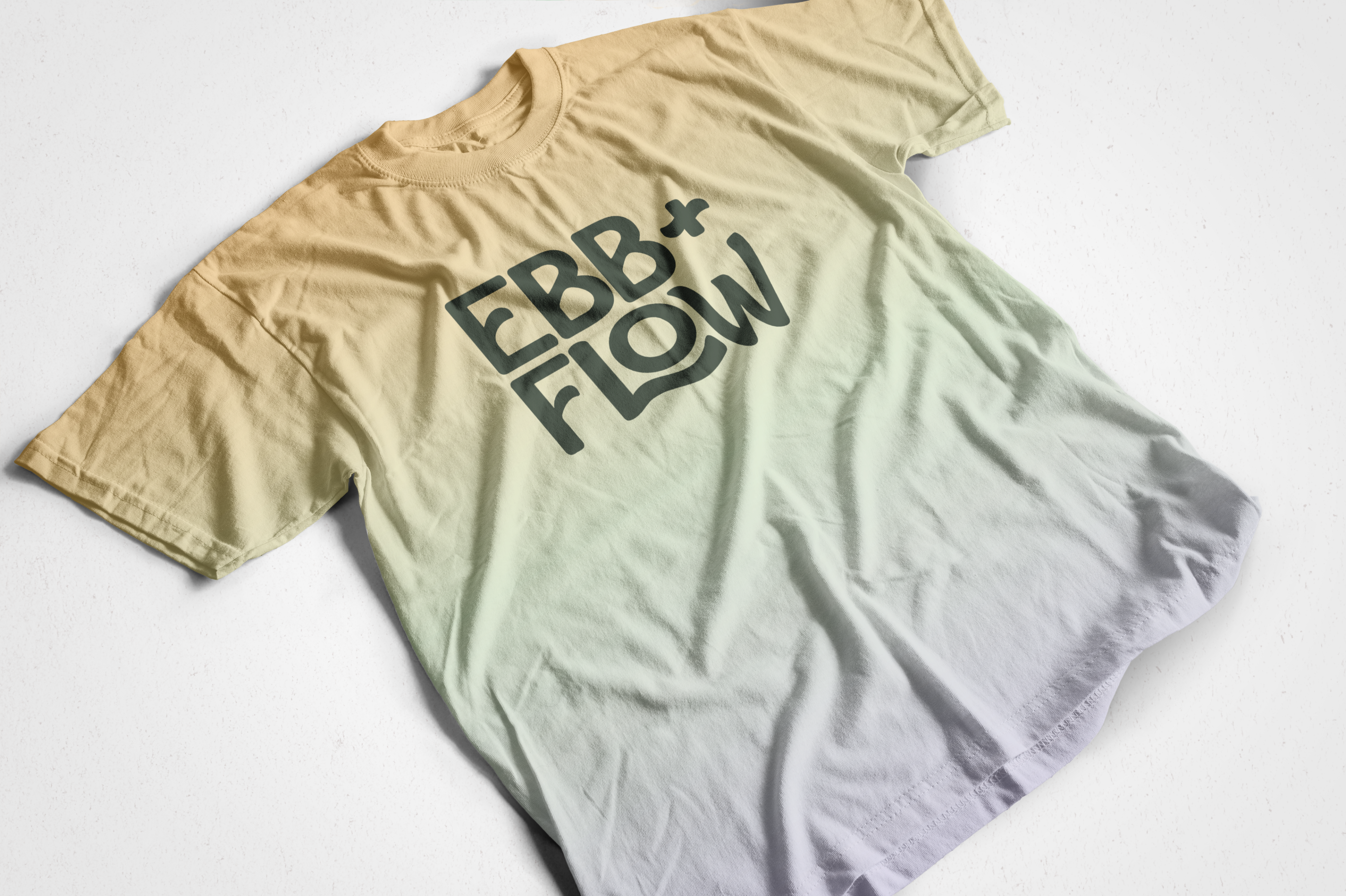
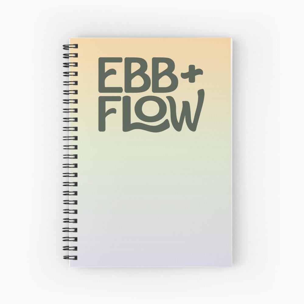
Ebb and Flow Branding
Adobe Illustrator, Adobe InDesign
Lorem ipsum